Besides alerting, I always prefer to have a dashboard of my data flow to get an overview of the overall performance. In most cases I end up with a dashboard with too many graphs, or even multiple dashboards.
Using the flowcharting plugin for Grafana, you can use Draw.io diagrams and put your metric on top of it. This way you have a visual representation of your data flow, including the performance metrics in a single overview. The integration with Office 365 and Microsoft Teams apps enhances its functionality. Additionally, it is compatible with Google Drive within the Google Workplace ecosystem.
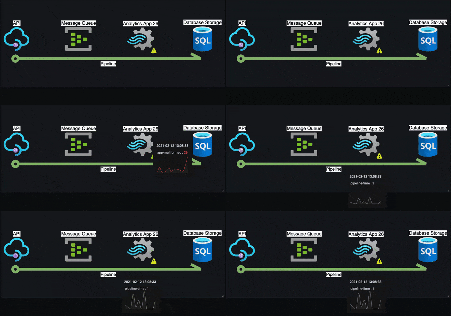
This blog will guide you through the process of making the following Grafana dashboard. It represents a simple data flow including graphs that popup when hover over the different objects, show a warning icon if certain thresholds are reached.
Prerequisites:
- Docker or a Grafana instance
- Draw.io (optional)
Note: You could also use the online Draw.io edition.
Step 1: Preparing your Draw.io diagram
Any Draw.io diagram can be used, including mind maps and org charts. But to make things easier, it is important to change the name and unique identifier for every object in the diagram. These recognizable attributes will help you to link Grafana queries to the correct object in the diagram.
For now I would recommend to download the example diagram and use the import function to open it in Draw.io.
If you are creating your own Draw.io diagram, checkout the steps below for renaming the unique identifiers. In the example diagram this is already done, so we can continue with Step 2.
Renaming the identifiers
I would recommend setting a text label for each object on the diagram. Just double click on an object and type your label. The text labels will help you to recognize the objects within the XML representation of the diagram when renaming the identifiers.
From Draw.io click Extra >> Edit Diagram…. This will show your diagram represented as XML.
Every mxCell object is an object in the diagram and contains the attributes name and id. The name should look familiar based on the text labels.
Step 2: Spin up Grafana
For this example, I used Docker. The following command will spin up Grafana, with the correct plugin (agenty-flowcharting-panel) installed.
docker run -d
  -p 3000:3000
  --name=grafana
  -e "GF_INSTALL_PLUGINS=agenty-flowcharting-panel"
  grafana/grafana
If successful, you can browse to localhost:3000 and Grafana should show up.
Login using admin / admin and change the password.
Alternative, using your own Grafana
If you already have Grafana running, with the following command you can install the plugin. Don’t forget to restart Grafana after installing the plugin.
grafana-cli plugins install agenty-flowcharting-panelStep 3: Add the TestData data source
For this blog we use the test data source in Grafana to create sample data for our graphs.
Assuming you have the Grafana interface open, follow these steps:
- Click
Configuration>>Data Sources - Click
Add data source - Search for
TestData - Click on
TestData - Click
Save & Test
Step 4: Create sample graphs
Let’s create a Dashboard with a single panel and 7 queries.
- Click
+>>Dashboard - Click
Add new panel - At the left bottom you see a tab called
Query (1), it has already a defined query calledA - Change the query name into
api-incoming-requestsby clicking on the pencil icon behind theA - Set the
Scenario,AliasandString Inputaccording to the values in the table as shown below.

- After each query click on the
Duplicate queryicon to add the next query.
| Query | Scenario | Alias | String Input |
|---|---|---|---|
| api-incoming-requests | CSV Metrics Values | api-incoming-requests | 62,89,96,57,90,68,91,53,91,77,99,79 |
| queue-message-in | CSV Metrics Values | queue-message-in | 81,77,97,57,77,85,99,74,52,48,63,68 |
| queue-message-out | CSV Metrics Values | queue-message-out | 51,69,52,80,75,48,72,97,45,46,64,53 |
| app-mallformed | CSV Metrics Values | app-mallformed | 1,9,2,0,5,8,2,7,5,6,4,3 |
| database-cpu | CSV Metrics Values | database-cpu | 90,48,99,74,77,71,92,49,74,52,49,64 |
| database-disk | CSV Metrics Values | database-disk | 16,16,16,17,17,18,18,18,19,20,20,20 |
| pipeline-time | CSV Metrics Values | pipeline-time | 0.3,0.2,0.1,0.8,0.2,0.5,0.1,0.9,0.1,0.1,0.1,0.5 |
Your graph should look like this

Step 5: Change the graph into the Draw.io diagram
We need to “export” our diagram to XML, and “import” this into Grafana. Draw.io can be used to create process diagrams and UML diagrams, which can then be exported to Grafana.
In Draw.io (export):
- Click
Extra>>Edit Diagram…. This will show your diagram represented as XML. - Select the XML and copy this onto your clipboard
In Grafana (import):
- On the right, click the tab
Panel - Expand the
Visualizationssection - Click
FlowCharting
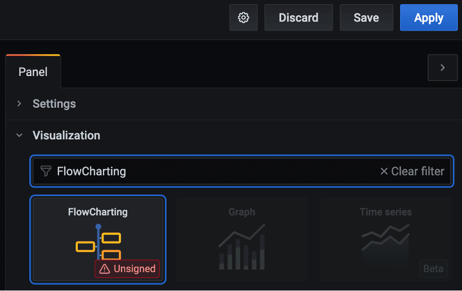
- Expand the
FlowChartsection that just appeared below theVisualizationssection - Replace the contents of
Source Contentwith our diagram by pasting the XML. Don’t worry if you diagram is not loading correctly! - Enable the following option(s):
a. Allow draw.io source – this will load the diagram correctly
Step 6: Link Grafana queries to the diagram objects
Now it is time to link our queries to the objects in the diagram. The plugin is using rules for this.
- Expand the
Mappingsection in the right tabPanel - This will show a default rule called
MyRule - Expand the default rule
MyRule - Configure the rule according to the values as show the table API. Each table is a single rule. The screenshot below shows the outcome after the first rule
apiis configured.
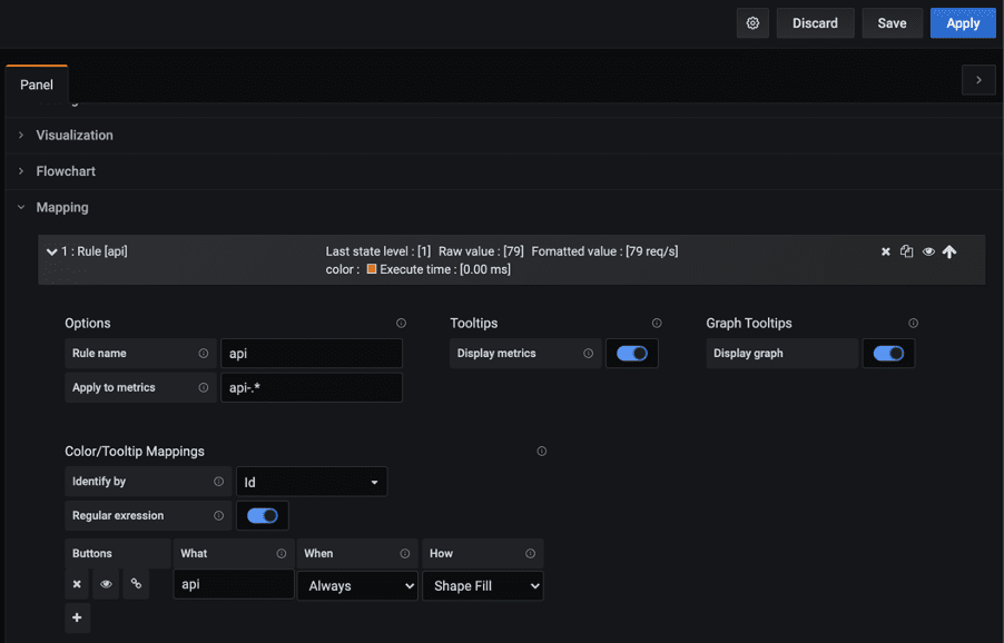
Note: you might see more fields and options, but these are the important once.
- Scroll up a bit, and collapse the just created rule to make some space
- Click on the
Clone this ruleicon to add the next rule.
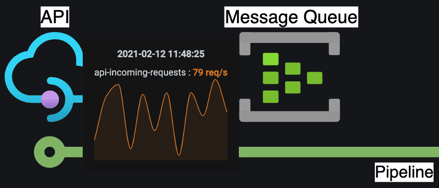
After adding the first rule named api, you should see a graph if you hover your mouse over the API object.
Step 7: Setting thresholds and making them visible
For each rule you can set threshold values. If a certain threshold is reached, the state of that rule is changed from [0: Ok] to, for instance, [1: Warning] or [2: Critical]. Based on this state we can modify the appearance of the objects. You can change the text, size of the object, show a little warning icon, or let it old-school blink.
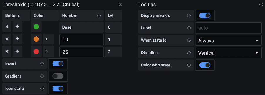
To give you an idea how to set this up, we will add a threshold for the app to warn us when the number of malformed messages in the APP is above 10.
- Expand the rule
app - Enable
Icon state. This will show a little warning icon near the App object. - Enable
Invert. This will invert the threshold logic. - Set the following thresholds:
Color Number Lvl (state) Green Base 0 (Ok) Orange 10 1 (Warning) Red 25 3 (Critical) - Under Tooltips, enable
Color with state. This will change the color of the graph to match the state (Green, Orange, Red). If you have multiple graphs in a popup, this will make it easy to see for each graph the current state.
Step 8: Trigger the rule and see what happens
Trigger the rule by adding an extra data point to the app-mallformed query.
- Find the
app-mallformedquery in the tab calledQueryat the left bottom - And add
,12to theString input
In the diagram a warning icon is displayed near the App object. If you now hover your mouse over the App object, you will see that the graph change to orange. Go ahead and add an extra data point (,26) to trigger the next threshold level and check that the graph will change to red.
Done
By now you should have a Diagram with 5 objects (arrow included) as shown at the beginning. Hovering over any object should popup the different graphs, a warning icon is shown near the APP, and the APP graph should be colored red.
Extra: More fun with rules
Go back to the app-mallformed rule, and look for the following options:
• Label/Text Mappings
• Link Mappings
• Event/Animation Mappings
These can manipulate the diagram objects for a certain state. Using them is similar to how you set the thresholds in step 6. I’ll briefly explain the options.
Label/Text Mappings
This can be used to change the text label of the object in the diagram if a certain threshold is reached. The configuration below will append the value.

Link Mappings
Based on the threshold values you can set an URL for the object in the diagram. This can be used to link to a more detailed dashboard for the App for instance.
Event/Animation Mappings
To make it more <em>bling</em> <em>bling</em> you can add animation to objects, text labels and arrows in your diagram.


