In the previous part of the article, we talked about importance of responsiveness in HTML e-mail templates and some good practices. In this part we will reveal more about developing process.
As demonstrated by many examples in the design, marketing and software development areas, a good HTML template has to be made in cooperation with specialists from every domain. We should have a nicely designed template, implemented and well tested by software developers and filled with the proper content by marketing specialists. In most cases, to ensure quality, all the requirements have to be collected and managed by analysts.
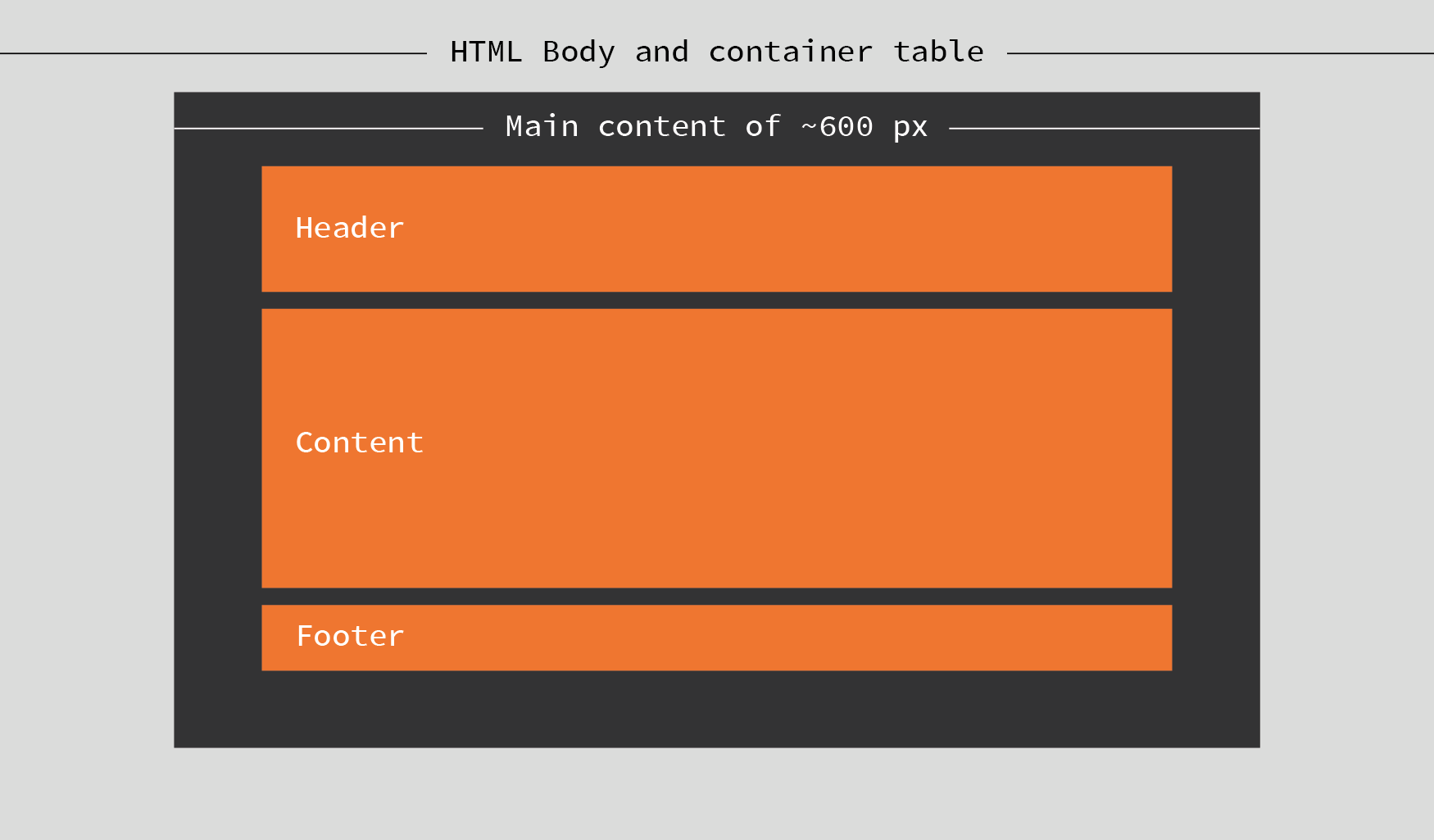
An email text, sometimes with images (now, even with video), can differ much depending on the message type. So graphic designers and frontend developers working on a template should provide some kind of a skeleton suitable for any content. This is done by inserting the whole email in a container table placed in the HTML body as you can see in the diagram below.
Every part is then placed inside and positioned by the parent’s align property instead of floating. Any spacing is done by adding padding to the parent rather than a margin to the children – this is caused by Microsoft Outlook’s lack of box-model support. So, the most important things in building an email template are:
- Base them on fluid HTML tables - width set to 100%, max-width to your template width (600px for example)
- Use ghost tables – table, table row and table cell tags placed in an HTML comment with Microsoft Outlook annotation. Its width has to be set to units in pixels (px) not percent (%) units, because Outlook doesn’t support a max-width property. This workaround lets us keep email for desktop as it was before mobile. On mobiles this commented table isn’t taken into account, so we have a table adjusted to the device width.
- Use div tags to wrap content presented as responsive grid columns. Position columns by adding align property to a parent element. Set its width to a percentage of the parent width, adding min and max width. Also, wrap this element in another ghost table with fixed width.
- If possible, don’t complicate anything and stay with progressive enhancement – rounded corners are a good example. Base everything on features you can use. Despite progressive enhancement, basic functionality has to be ensured on every client. So you can use @media query with the awareness that it is not supported everywhere.
- Mobile first - Gmail doesn’t support the aforementioned @media queries used for responsive web content. So, according to progressive enhancement, we should provide a simple, responsive grid for our content and then, if everything is working and “floating” right (even on Gmail), we can add media queries with additional features for other clients.
If you want to build your own skeleton, you should look at how it is done by others. One of the best templates that can be found is Cerberus by Ted Goas. It’s available on Github and probably every issue you will have to handle (for example unnecessary spacing between grid columns at 120dpi) has already been solved there. We have run some test of this template on EmailOnAcid and it has done very well. How to build a template that looks perfect on almost every client? Workflow is the most important thing.
Workflow
Every project needs an individual approach, but we can specify a general to-do list. This can help us avoid problems in the future, save time and prevent frustration. Performing these actions doesn’t take much and gives our work a great starting point if we have more than one template to be done.
Research
Check the content in every design or existing template. Pay attention to elements like the headers, footers, buttons, headings, paragraph stylings, lists, icons and images… Prepare a simple list or SASS/CSS file with their definitions.
Setup and development
There are some services that make creating an email template easier and much faster than writing inline CSS for HTML tags by hand. Litmus (editor sample) or EmailOnAcid mail testing services have online editors which are quite nice (but non-free). For small projects, we can also use other online tools like Premailer or Ink Inliner, which compiles our template from separate HTML and CSS, to one single file as a ready email template. For more complicated or larger projects with multiple templates there are also frameworks prepared for email templates:
- Zurb Foundation for Emails 2 – recently updated to a new version, allows us to compose email from preconfigured tags compiled into standard HTML. This is a great tool, but you have to be prepared for some limitations like partial Android Gmail support.
- MJML – Another nice framework, like Zurb Foundation, based on custom tags which compiles to HTML. The only issue that can be found is that there is no CSS inlining tool included. It is based on React and prebuild components make the work done quite fast, but if we need to change something in a component it can take longer and requires knowledge of React.
Choosing the tool for our needs is not easy. Some time is needed for every project for research and benchmarking between the constantly evolving solutions that are currently available.
But sometimes, none of these fit our needs or meet the requirements. In that case, we have to build our own tool. We can inline CSS locally in our development environment by using an offline version of Premailer or Ink Inliner. Our own tool also gives us many customizable options, despite it taking more time in the beginning to configure, we have flexibility and configurability like no other solution.
While working on several mailing campaigns, it is important to feel comfortable with your development environment. If any existing framework does not meet the requirements, there is a decision to be made: Do we adapt to a solution being considered or create a build tool of our own? Adapting frameworks is quite risky because it can cause problems with updates, needs experience and sometimes it can take too much time without the guarantee of a successful modification.
Build tool of our own
It is always challenging to abandon a dedicated tool and start building something from scratch. Can we create anything better than an existing framework made by many contributors? In most cases, probably not, but HTML emails are specific. Of course, we can write every template by hand without any building scripts but… It just takes too much time and it is hard to maintain such code. That is why even frontend code is now being compiled. In my opinion, if we have doubts as to whether a framework will fit our needs and don’t have time to research, it’s always worth it to create our own custom built tool.
Maybe building a tool sounds like a lot of work, but is more like stacking Lego blocks. We can base it on well-known and popular technology like Node.js. With the built-in Node Package Manager it allows us to add dependencies on components like file include, a styles preprocessor and inliner, HTML code minifier, etc. to our project.
So where should we start? Project structure comes first, to get things organized:
- Src
- Styles
- Sass
- CSS
- HTML
- Templates
- Partials
- Images
- Styles
- Build
- Temp
Of course, it’s just an example; you can organize your resources as you want. This is not imposed. So, what next? Email HTML is old-fashioned, but we don’t want to code an HTML template with CSS in the style attributes like developers did many years ago. We don’t even want to write CSS code by hand at all. We want it modern, compiled and easy to maintain. So a CSS preprocessor is needed and a “premailer” previously mentioned to make styles inline. We just have to tell our package manager to download these packages and remember them for development purposes. We also need a component to rule all the other components – like Grunt or Gulp. Firstly, we have to tell Node that this project needs its components. Open your command line tool and type:
npm init
Node will ask about the project name, author, version, repository url, etc. – it’s not required but, if possible, don’t leave blanks. It can help other developers if someone has to work on this code in the future. Now, we are ready to specify all the requirements: npm i -D del gulp gulp-sass gulp-cached gulp-file-include gulp-htmlmin gulp-livereload gulp-premailer gulp-remove-html-comments gulp-replace run-sequence
Seems like a lot of packages, but it shouldn’t take long to download them. What are the i and -D parameters? These are shortcuts for the install command and the --save-dev parameter which tell NPM to save all the downloaded components to your project development dependencies. If you are not familiar with Node packages check this short article. Now that we have all the needed tools, it’s time to think about our template.
We can prepare repetitive elements in partial files and include them using gulp-file-include with some customizable variables. So, we can have an HTML table defined once and used multiple times, changing any parameter if needed or using defaults. Our main template then is small and easy to work with.
       @@include('partials/button.html',
            {"href":"http://www.pgs-software.com",
             "text":"Visit PGS Software webpage"})
What about styles? There are fewer and fewer developers writing pure CSS code, instead there are Less and Sass preprocessors just making it better and faster. It is easier to read and maintain, provide some optimization and extended functionality compared to CSS, thanks to the variables and functions called here mixins.
After including partials and inlining styles we can even minify the entirety of the compiled code to save email downloading time and data-transfer used by gulp-htmlmin.
See here Gulp task runner configuration sample code.
If you don’t know gulp, you can check its basics here, this should help you fully understand what is going on here. We are running Gulp tasks in the right order to finally get all the email ingredients together in a spicy but raw HTML-CSS-soup ready to be sent by any mailing provider.
Afterwards the development process images should be moved to a dedicated server and paths in the template updated. There is a way to encode images to base64 and include them in email as text or send them as an attachment, but there are more cons than pros with these solutions. Bigger images should be linked, while smaller ones like icons or logos can be added to email but there are no noticeable benefits and we have to prepare the images beforehand.
The third part of our article will appear soon. Stay tuned!
More from this Series
Written by
Xebia Author
Our Ideas
Explore More Blogs

Where the GitHub Copilot Extension Points Break Governance
A lot of the recent additions to the GitHub Copilot ecosystem add real value for individual developers, yet they also expand the security surface that...
Rob Bos


Contact