The more complicated applications you write, the more sophisticated user controls you’ll need. Android offers a big collection of default controls, which provides some basic functionality.
If that’s not enough, you may try to combine them and create composite controls (fragments) to help tackle some more complex tasks. But this solution has its limits and finally both standard controls and composite ones won’t be enough anymore. This is the time you’ll have to implement your own, custom controls. And this is precisely what we’ll do today.
Research and planning
First of all, spend some time on thinking on what your control will do. Maybe there’s someone who already wrote such a control? If so, consider using it – even if it won’t fully fit your needs, sacrificing some functionality to save many hours of work is probably justified. A good start for searching for advanced controls is Android Arsenal.
If you didn’t find what you are looking for, read on.
Custom control
So you decided to write your own control from scratch. Cool! This actually can be quite a fun task. Let’s take a quick look at the aspects of custom control you have to consider.
Layout
Android framework has quite a powerful layouting system, which allows you to set a fixed control size, wrap to its content size or to match its parent size; the controls can also be placed in various types of containers, which have their own rules for layouting children controls. When you write your own control, you have to design a predictable strategy for sizing your control, enabling it to flawlessly fit into this system.
Look
This is, obviously, one of the most important aspects of custom controls. Android allows you to implement both 2D and 3D controls by providing necessary base classes and tools. To draw your control you may use both primitives (lines, ellipses, rectangles), complex drawables and images, so effectively you have full control on how your control will look. Try to keep in mind though, that mobile applications have specific requirements for user controls (for instance, they must be big enough to be operated by touch).
Interaction
Default controls interact with user in a predefined way. When you write your own custom control, you have to implement this mechanism on your own. Fortunately, Android provides you with all the information on what the user is trying to do (keyboard and touch events, including multitouch), so you know everything you need.
Attributes
Initial look and behavior of controls is controlled by XML attributes. For instance, if you want to set up the size of text on the control, you can use android:textSize attribute. Android allows you to create custom attributes for your controls and later get their values from the code, such that you can simplify the process of setting up the control in activity or fragment.
Sample control
Let’s start with a very simple control.

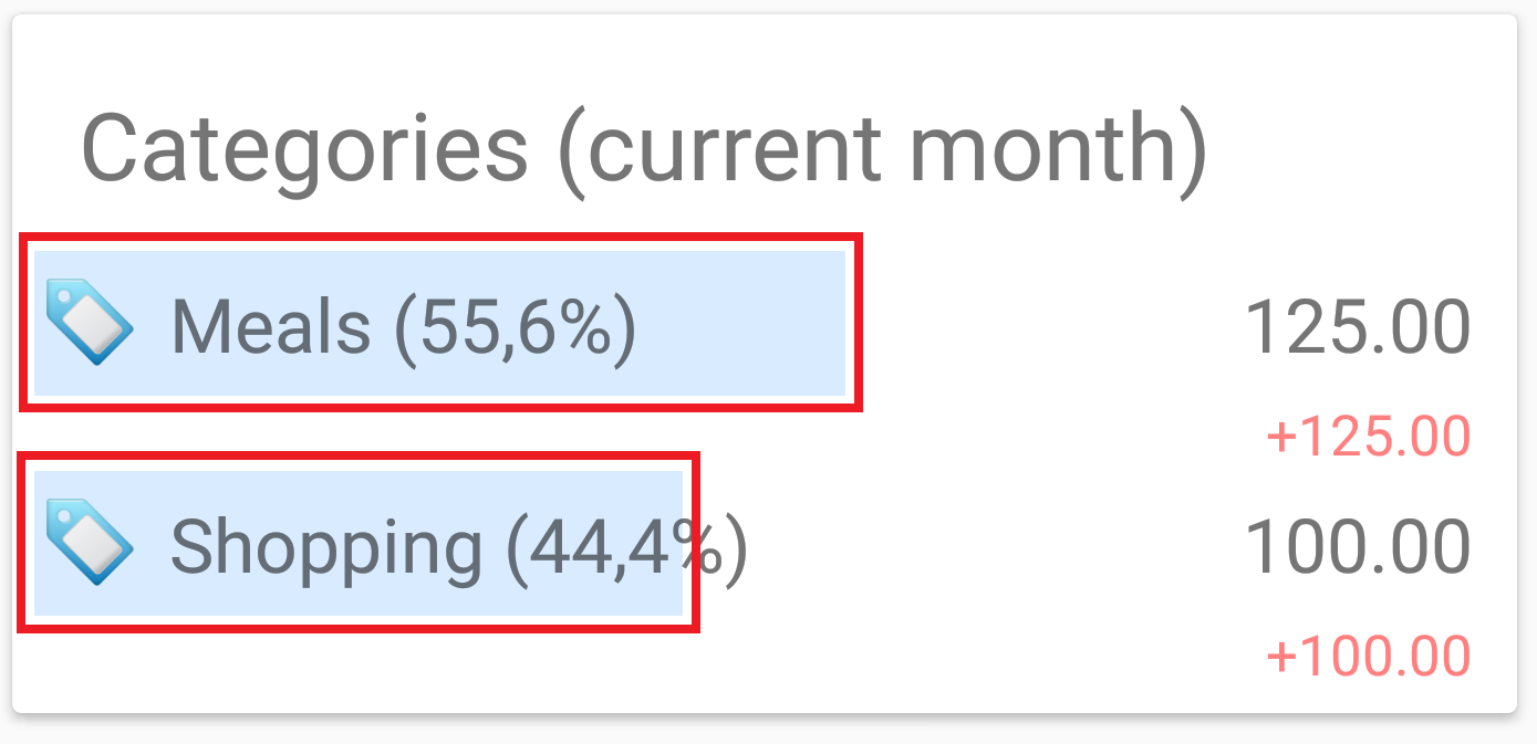
We will write a control, which will serve as a background histogram bar for statistics list entries. The special requirement is to be able to set bar’s width as a percentage of full control’s width instead of absolute values (for instance, device pixels). Of course, this can be achieved without writing a custom control, but for the sake of exercising let’s start small and write something on our own.
Basics
First of all, create a package in the project, which will contain our controls. Then add a new class and call it PercentBar. The initial code should look like the following:
import android.view.View;
/**
 * Created by Wojciech on 2016-06-20.
 */
public class PercentBar extends View {
}
Since controls in Android are called views and View class – as one may guess – is a base class for all views, we will descend exactly from this one. Since View does not have parameterless constructor, we’ll need to override one. Let’s choose this one:
public PercentBar(Context context, AttributeSet attrs) {
    super(context, attrs);
}
The attrs parameter of type AttributeSet will prove useful when accessing custom attributes. We will come back to this issue later.
Now let’s focus on layout. As you know, a control in Android must have layout_width and layout_height attributes defined. Also, both of them can contain either a size unit (like 10dp) or one of two special values: match_parent or wrap_content. The first one tells the control, that one of its dimensions must perfectly match its parent dimension and the second one asks the control to be as small as possible (in specified axis), but without covering its contents. These values are not passed to the control directly; instead, they are used by the layouting system and control’s parent container (ViewGroup) to evaluate, how big the control may be. Keep in mind, that even though control wants to be of a specific size, sometimes this is not possible (for instance, because its parent is not big enough) and will have to be trimmed. So remember to implement the control in such way, that it will ask for as much space as it needs, but also will be able to draw itself on an area smaller than requested.
A control takes part in the layouting process by overriding and implementing onMeasure method:
@Override
protected void onMeasure(int widthMeasureSpec, int heightMeasureSpec) {

}
Parameters contain encoded information about control’s width and height requirements and values regarding these requirements. You may use View.MeasureSpec.getMode and View.MeasureSpec.getSize and pass one of these parameters to obtain measuring mode and size, respectively.
There are three possible measuring modes:
- MeasureSpec.UNSPECIFIED – control’s parent does not specify any requirements for a dimension and control can be as big as it likes.
- MeasureSpec.AT_MOST – the control may be as bit as it likes, but up to specified value.
- MeasureSpec.EXACTLY – control’s parent has evaluated specific dimension values for the control and they will be used regardless of how big control wants to be.
There’s one more restriction: if you implement onMeasure, you’re obligated to call setMeasuredDimension and pass evaluated dimensions before onMeasure method exits. If you don’t fulfill this contract, an exception will be thrown.
As you know, there are a few types of units you can use to specify control’s size, e.g. dp (device pixels), sp (scalable pixels) and so on. In this method though, we’re operating on raw pixels. This is also to be considered when evaluating control’s size; if you want to read more about units and unit conversions, head to documentation and this StackOverflow thread.
Layout
Let’s get back to our histogram bar control and implement onMeasure. Since the control is very simple and doesn’t have any nested content which would force it to be of a specific size, as in the case of MeasureSpec.EXACTLY and MeasureSpec.AT_MOST, the control may use as much space as it is being given and if there are no restrictions (MeasureSpec.UNSPECIFIED) and we may use some predefined dimension values:
private final int DEFAULT_WIDTH = 100;
private final int DEFAULT_HEIGHT = 100;
(…)
@Override
protected void onMeasure(int widthMeasureSpec, int heightMeasureSpec) {
    int width = 0, height = 0;
    switch (View.MeasureSpec.getMode(widthMeasureSpec)) {
        case MeasureSpec.AT_MOST:
        case MeasureSpec.EXACTLY:
            width = View.MeasureSpec.getSize(widthMeasureSpec);
            break;
        case MeasureSpec.UNSPECIFIED:
            width = DEFAULT_WIDTH;
            break;
    }
    switch (View.MeasureSpec.getMode(heightMeasureSpec)) {
        case MeasureSpec.AT_MOST:
        case MeasureSpec.EXACTLY:
            height = View.MeasureSpec.getSize(heightMeasureSpec);
            break;
        case MeasureSpec.UNSPECIFIED:
            height = DEFAULT_HEIGHT;
            break;
    }
    setMeasuredDimension(width, height);
}
Our control is not supposed to be standalone (e.g. we will use it as a background for other controls), so it doesn’t have specific requirements for size. That’s why the size of 100×100 pixels is assumed when none is specified – this situation should never happen during normal usage.
Width percentage
Since we want the bar’s width to be a percentage of the whole control’s width, we need an appropriate field with getter and setter, which will control the percentage value:
private float percentage;

public float getPercentage() {W
    return percentage;
}

public void setPercentage(float percentage) {
    this.percentage = percentage;
    invalidate();
}
Note, that setter calls an additional method: invalidate. Since changing percentage requires the control to be redrawn, we call invalidate to inform the framework, that the control no longer displays correct content. The decision on when exactly the control will be redrawn is left to the framework because of performance reasons – the framework can arrange controls, which reported such need in specific order and group them to avoid unnecessary drawing passes.
Attributes
Now we may start thinking about drawing the control. It won’t be a hard task – we only need to draw a filled rectangle of a specific size. But if we want to do it in the spirit of Android, we should allow the user to specify a drawable, which will serve as background for the histogram bar. And this is where attributes come in.
To specify custom attributes for a control, we need to prepare an XML file containing names and types of attributes. In our case it will be called attr.xml and will look like following:
The declare-styleable tag informs which class represents the control we want to give custom attributes; each attr tag specifies one attribute with specific name and type. Since we want to obtain a reference to a drawable object, we use reference as a format (type of attribute).
Now we only need to find a way to get the value, which was set to the attribute in layout XML file. This is where AttributeSet parameter of constructor comes in.
private Drawable barDrawable;

public Drawable getBarDrawable() {
    return barDrawable;
}

public void setBarDrawable(Drawable barDrawable) {
    this.barDrawable = barDrawable;
    invalidate();
}
public PercentBar(Context context, AttributeSet attrs) {
    super(context, attrs);

    percentage = 50.0f;

    TypedArray a = context.getTheme().obtainStyledAttributes(attrs, R.styleable.PercentBar, 0, 0);
    try {
        setBarDrawable(a.getDrawable(R.styleable.PercentBar_barDrawable));
    } finally {
        a.recycle();
    }
}
Keep in mind, that user may not set an attribute at all and in such case we should set the underlying field to some default value.
Drawing
Finally, we can focus on drawing. The whole drawing should be performed in an overridden onDraw method. Android framework provides Canvas object, which allows performing all the tasks that need drawing.
@Override
protected void onDraw(Canvas canvas) {

    super.onDraw(canvas);

    if (barDrawable != null) {
        barDrawable.setBounds(0, 0, (int) (canvas.getWidth() * (percentage / 100.0f)), canvas.getHeight());
        barDrawable.draw(canvas);
    } else {
        Paint p = new Paint();
        p.setColor(Color.rgb(255, 0, 0));
        p.setStyle(Paint.Style.FILL);
        canvas.drawRect(new Rect(0, 0, canvas.getWidth(), canvas.getHeight()), p);
    }
}
Edit mode
Android framework offers one more feature, which we won’t use here, but which surely is worth mentioning. Since Android Studio uses control normally in preview window, we may use special method: isInEditMode() to determine, whether control is used in live application or in edit mode in Android Studio. In the latter case the control may display fake placeholder data, which will allow programmer to see how the control will look when filled with real data. Even some of standard Android controls (like RecyclerView) take advantage of this feature.
Using control
Let’s try out our new control. To place it on an Activity, we have to use fully-qualified class name. Attributes require additional XML namespace, but we may use good old res-auto to resolve it.
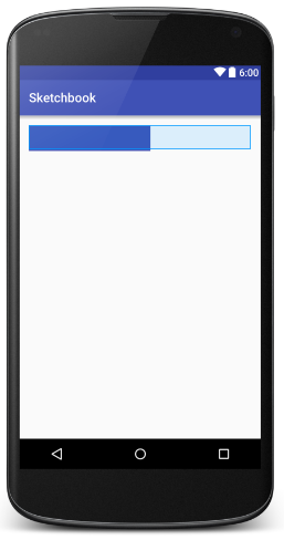
Finally, rebuild the project to see working control in the Preview pane of Android Studio:

Source code of the sample application can be found on our GitHub repository.[:]


