Using OutSystems UI Components in the right way
Using OutSystems UI Components in the right way can be a game-changer for developers who want to streamline the UI development process.
Instead of building UI elements from scratch, OutSystems offers a wide range of pre-built components that are flexible, customizable, and easy to use. In this article, we will explore few best practices for using OutSystems UI components to ensure that you are making the most of this powerful tool.
Customization and Adaptability with OutSystems UI Components
One of the greatest benefits of using OutSystems UI components is the high level of flexibility and customization they offer. The platform provides a wide variety of pre-built UI elements, such as buttons, forms, tables, and charts, among others. These UI components are designed to work seamlessly together and can be easily customized to meet specific design requirements.
To further facilitate customization, the OutSystems platform offers a visual editor that allows developers to drag and drop UI components onto a screen. This eliminates the need for writing code and makes creating complex layouts easier.
Despite the ease of drag-and-drop, some concepts still mix with traditional code concepts. One simple example that is commonly seen with beginner developers is the excessive use of percentages and/or pixels instead of the responsive grid of OutSystems for layout adjustments.
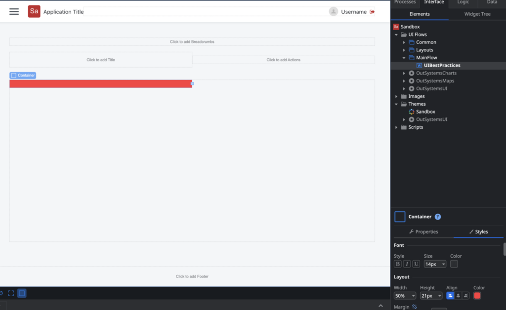
For instance, instead of defining a container with 50% of the total size:

The correct way is to define a container with 6 columns:
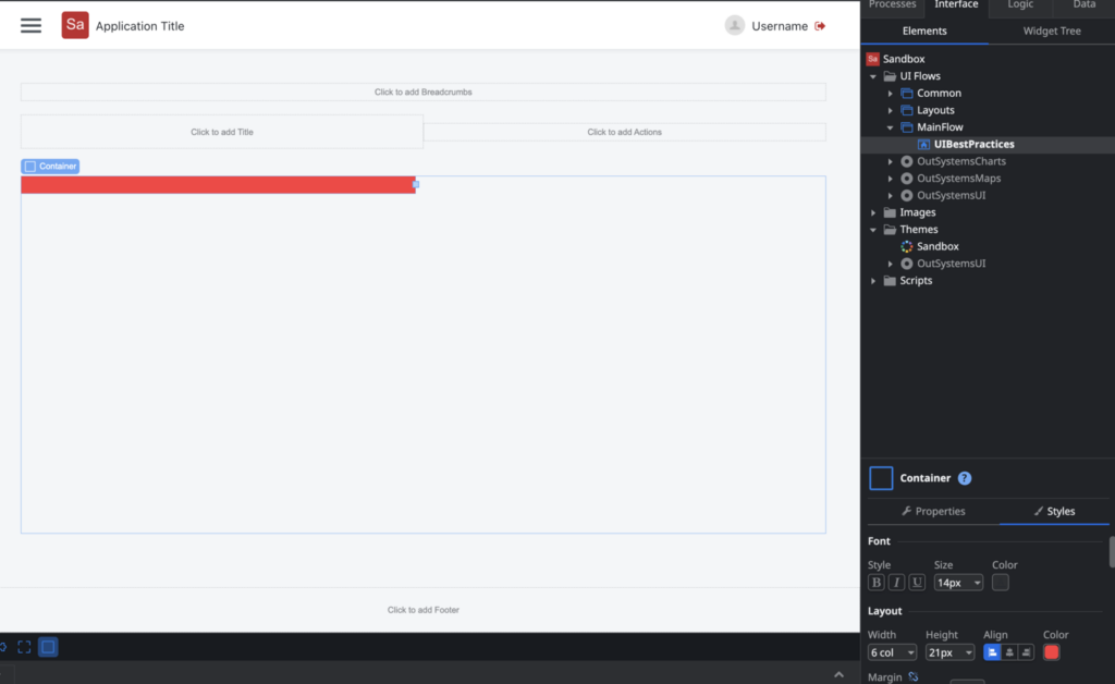

The visual output in the browser is the same at first glance, but the big difference is that it becomes responsive and optimized by default. Various things behave differently when we use the platform the way it should.
Let’s take a look at one of the differences when using percentages and/or other measures versus using the responsive grid columns of OutSystems:
- With percentages, we can see that only the percentage is added when inspecting the element.
- When using the responsive grid columns (1 col, 2 col, 3 col, etc), there are other mechanisms that start to work and are responsible for making sure that you, as a developer, don’t have to think about everything, as OutSystems has already thought about many things for us.
As mentioned before, by default, the responsive grid has 12 columns, but it’s possible to customize it directly in your application’s theme:
The entire OutSystems UI library is published at Outsystemsui.outsystems.com. It is important to be aware of its components, as it is very common for beginner developers to start recreating things that already exist.
An important addition for studying and also for the day-to-day of an OutSystems developer is the CheatSheet.
The CheatSheet is an index of the OutSystems UI library, where you can easily identify patterns, colors, components, and all other elements defined in the library:
Outsystemsui.outsystems.com/OutSystemsUIWebsite/CheatSheet
Responsive Design
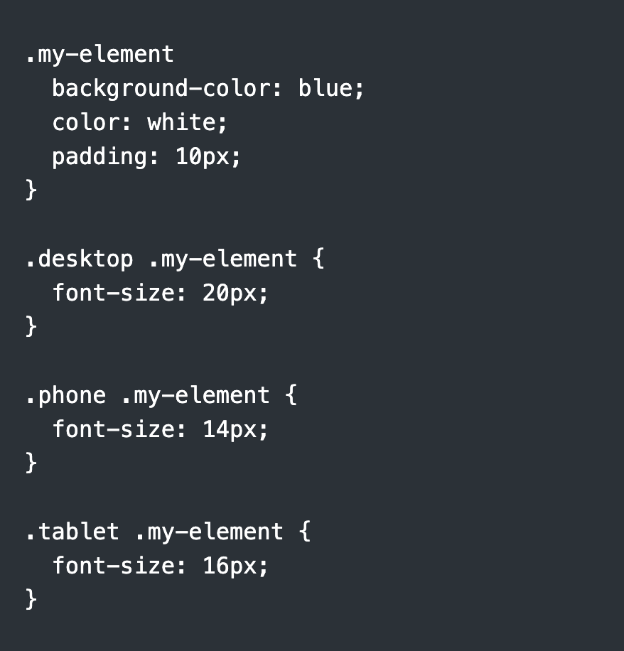
OutSystems provides several classes that developers can use to create responsive designs, such as “.desktop”, “.phone”, and “.tablet”. These classes allow developers to specify different styles for different screen sizes, without the need for media queries. The use of these classes can significantly reduce the amount of CSS code needed to create responsive designs, making it easier and faster to create UI elements that work on different devices.
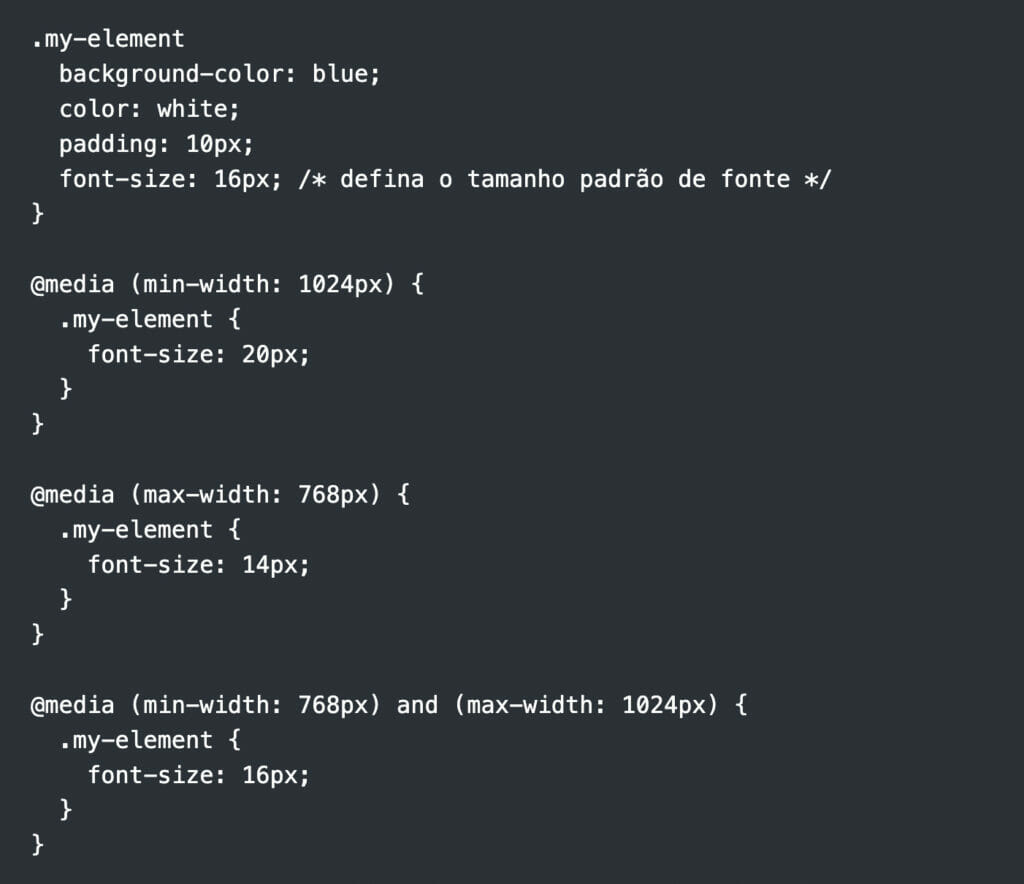
Suppose you want to apply a different style to a container with the class “my-element” on different screen sizes. In CSS, the best approach would be to use the media queries:
While OutSystems already has several mechanisms to achieve the same goal and because it is an abstraction, it goes even further. Check out the classes we have available in OutSystems applications:
Device: .desktop, .tablet, .phone, .iphonex
Orientation: .landscape, .portrait
Browser: .chrome, .firefox, .edge, .safari, etc.
Operating System: .windows, .osx, .ios, .android, etc.
Touch Device Detection: .is–touch
The classes above will be available by default in any application you create on the platform. We can make our code even simpler to solve the same problem we solved earlier:

More details about other facilities/accelerators that the platform has can be found at:Responsive UI
Accessibility
Accessibility is an important consideration when creating UI elements for web applications. Fortunately, OutSystems UI components are designed to be accessible and compliant with WCAG 2.1 standards. These standards define guidelines for creating accessible web content for people with disabilities, including those with visual, auditory, motor, and cognitive disabilities.
OutSystems UI components are designed to be easy to navigate and use, regardless of the device or software used to access the application. This includes the use of clear labels and descriptions for input fields, the ability to navigate UI elements using the keyboard, support for screen readers, and much more.
Conclusion
Well, we have come to the end of this article about using OutSystems UI components. I hope you enjoyed reading it as much as I enjoyed writing it!
As we have seen, using pre-built components can be a great way to speed up the development process and make life easier for developers, especially those who are new to UI design. And the OutSystems platform offers an incredible variety of UI components that can be easily customized using a visual editor, which means you can create complex layouts without writing a single line of code!
But, of course, it is important to remember that, even with the ease of using these components, it is still necessary to have some technical knowledge to use them in the best possible way. After all, sometimes practicality can make us forget important concepts, such as the correct use of responsive grids.
Anyway, I hope this article has been useful to you and that it can help you create amazing projects using the UI components of the OutSystems platform! Here is a free link to give it a try!
Visit my OutSystems Journal


