Do you notice something different in Google Drive, Docs, Sheets, or Slides? That may be right!
Google Workspace just gave all these apps a new look. Well, new isn’t quite true either. Last year, Google already introduced this design in Gmail. And now it has been extended further. This way you get one streamlined experience throughout your Google Workspace environment.
In addition to a fresh look, this update is mainly about improving ease of use. So the interface doesn’t just look nicer. The innovations also really contribute to smoother cooperation.
But… What has changed then?
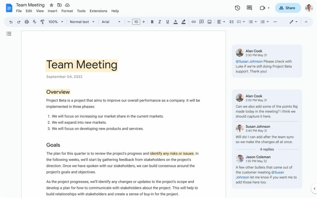
In Google Docs, Sheets and Slides you should not immediately expect major changes in terms of new functionalities and options. The interface has been simplified and made clearer, so you can find everything faster. Subtle visual updates and changes in color use make some important elements stand out more clearly. Such as the toolbar at the top and the comments you make in the document.
A novelty is the clock icon at the top right. This shows when the document was last edited. And with one click, it takes you to the Version History of the document.

In Google Drive, the redesign also brings functional improvements in addition to the modern look. Let’s summarize the most important ones:
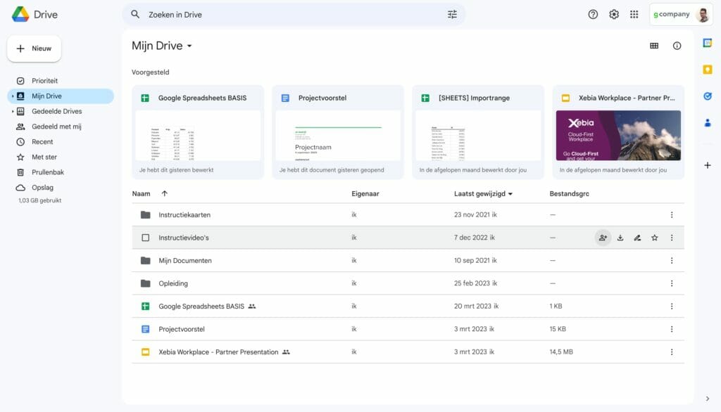
- Extra buttons appear as soon as you place your cursor on a folder or document. These give you quick access to common actions like share, download, rename and star ⭐️

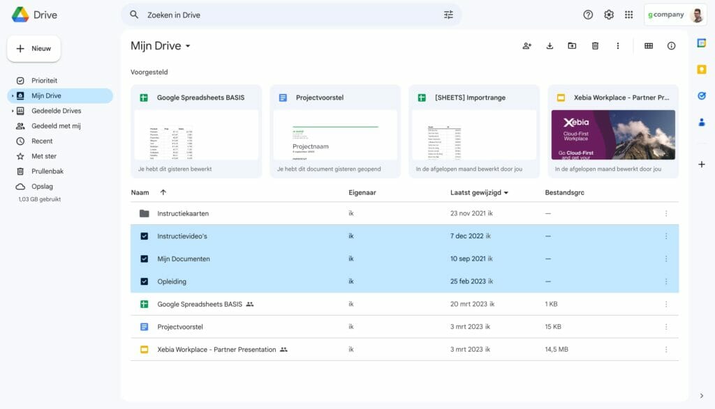
- The new checkboxes make it more convenient to select multiple items and perform bulk actions such as deleting documents.

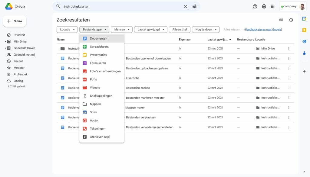
- The new search chips such as File type, oPeople and Last modified help you find your documents even faster.

We know… People generally don’t like changes, but we do hope that every change Google Workspace makes will help you in making your work more fun and easy!


