One of the less discussed Machine Learning appliances is time series prediction, which can be used for predicting the future values of your business metrics, but also for identifying the seasonality of demand in your specific trade. Here, I want to show one exact example of how this works – and why it’s so beneficial.
We will follow Gartner’s Prescriptive Analytics approach to gather hindsight, insight and foresight of the Traficar car sharing network’s activity. We will learn just how accurately we are able to foretell the utilisation of the car fleet currently cruising the streets of Wrocław – our home city.
Hindsight
You may remember our analysis of electrical car sharing network Vozilla, in 2018, when we published a whitepaper describing what we can learn from the prolonged observation of the car availability map. We analysed half a year’s worth of data, but there is one thing we didn’t tell you back then: we did not only scrape Vozilla’s web API, but also their local competitor, the car-sharing company called Traficar.
Some time has passed and, as I write these words, we have been scraping Traficar’s website every minute for over 21 months now.
In the following analysis, web scraping was the only source of data and we cannot guarantee its accuracy. Any conclusions regarding Traficar income or profitability may be plain wrong.
A single, isolated API data snapshot does not provide much information - it merely brings us a list of cars available for rent at a given time, with fuel levels and coordinates. Only after we start to track such data for prolonged timespans can we begin recreating the events and track any emerging patterns.
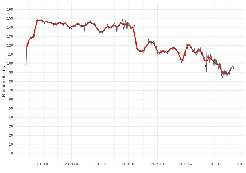
As we follow Traficar’s activity in our city of Wrocław, the first question should be: how many cars are/were available for rent?
After we group our records by day and count daily unique plates number, we can see the following graph - up to 149 cars are available at once but, in a given time frame, exactly 200 unique cars served the region. Some were added, while others disappeared - there were also a few electrical Renault ZOEs available for a short period. However, in the following analysis, we will only focus on Reno Clio passenger car rides, which form over 95% of all traffic from the company.
When it comes to rental activity, it takes some work to recreate events related to particular cars. First of all, for every vehicle, we need to assemble a series of uninterrupted minute-wise reports into “available” composite periods, which begin and end at known hours. Then, we are able to identify gaps between such periods, which constitute “rental” periods. For example, if a car disappears at one place and time, but reappears elsewhere, we can determine the duration and movement of that particular rental.
Unlike Vozilla, Traficar is fitted with classic combustion cars that don’t require any charging, so almost every one of these “rentals” is indeed an actual rental. To eliminate outliers, we drop a dozen hundred events longer than 12h, later analysing over 213,000 shorter ones.
By “some work”, of course, we are referring to the writing and running of scripts, which go through nearly a million files, extracting well over one hundred million records, covering the activities of 200 cars over 21 months. As usual, we have to patch some small holes in the data (like missing a minute or two here and there) and deal with longer data gaps - usually caused by Traficar’s website maintenance. We largely ignore such holes, as over 99% of the data is valid and we highly prefer to focus on long-time trends, rather than the short-term fluctuations.
So, just how many rentals and reservations did we record each day? Similarly, how many minutes did they all add up to?
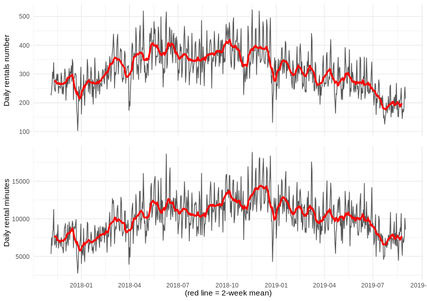
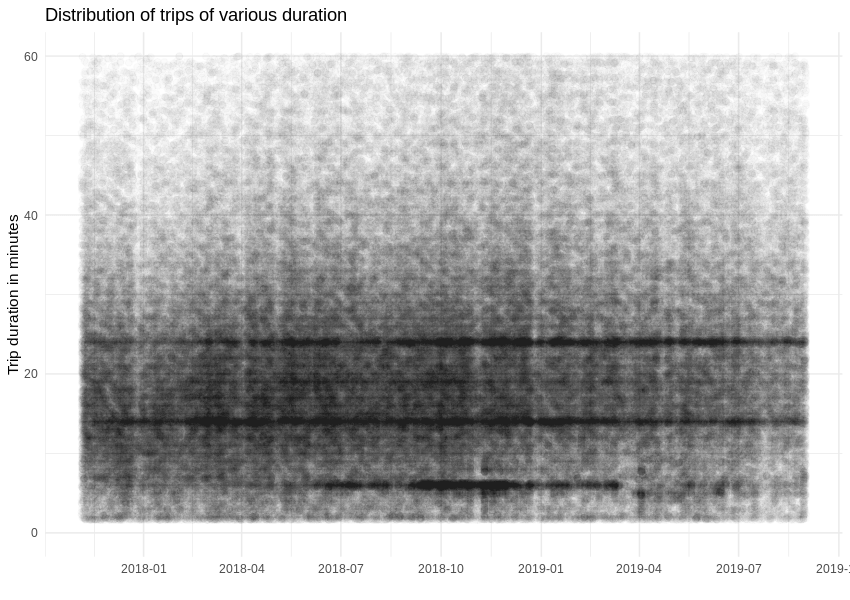
The duration of a single trip does not change much during the analysed period, but we can spot a strange popularity in regards to events taking 14 and 24 minutes.
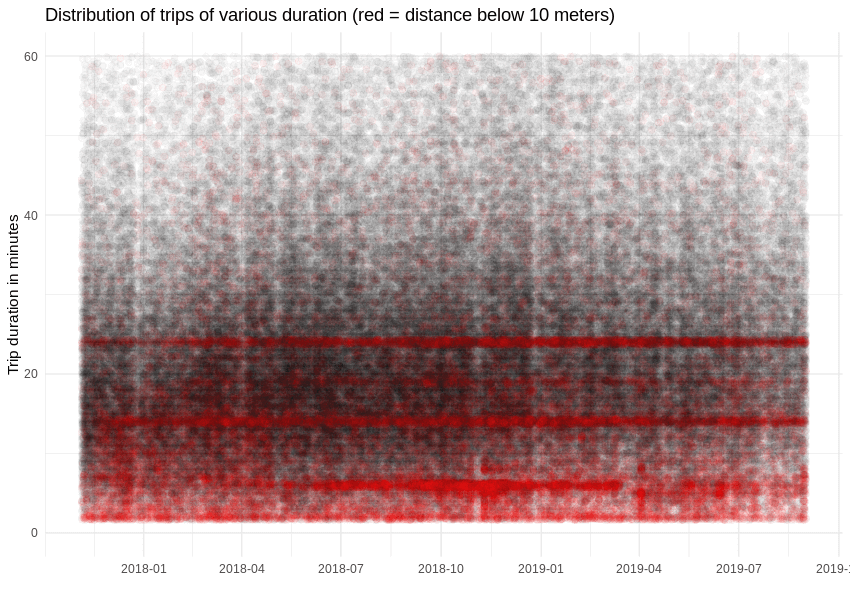
Since the car reservation limit is 15 minutes and can be prolonged in 5 minute increments, maybe the 14/24 minute patterns comes from cars that didn’t move at all? Let’s add some colour for events where the distance between start and end locations is smaller than 10 metres. Once that’s done, our suspicions are easily confirmed, as around 16% of events are abandoned reservations. We will ignore them from now on.
We can now take a look at the effectiveness of car network utilisation – specifically the number of minutes each car was rented each day, on average. It appears that, over time, citizens got used to Traficar as a method of commuting.
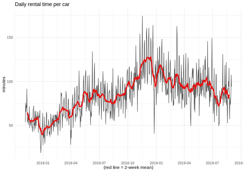
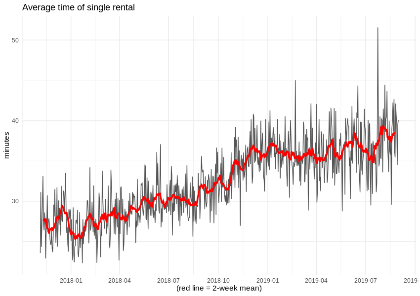
Also, despite reducing the number of available cars, the average duration of a single rental grew by 10 minutes. Alas, we cannot know the duration of pauses during each rental, so we are not able to estimate the operator’s income.
Insight
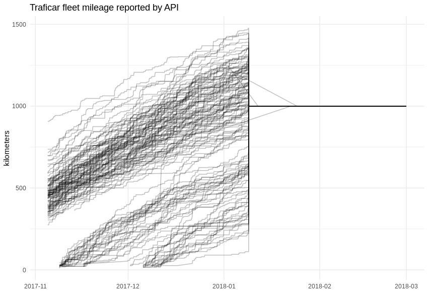
While working with data, one of the main goals is uncovering hidden dependencies and gaining knowledge which was previously unavailable. For example, through this approach, we can discover the mileage of Traficar’s vehicles. Of course, this is known to the company, but the API started to withhold that particular variable about two months after we started gathering data. After the 9th of January 2018, field “distanceAccumulated” in the API response was set to a constant value of 1,000 km.
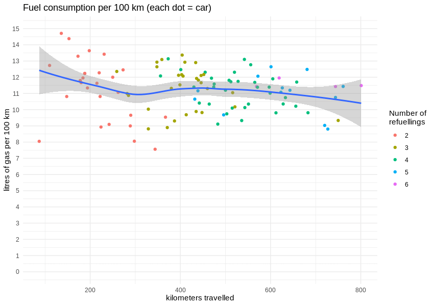
Fortunately, during that time, the cars were filled with gas around 100 times, so we can calculate average fuel consumption rates (or rather, the distance travelled per one litre of gasoline). The correlation between travelled distance and burned gasoline is visibly linear.
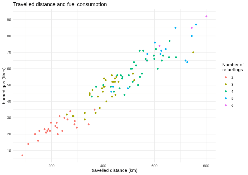
According to the manufacturer, a Renault Clio TCe 90 should burn up to 6 litres of gas per 100 km in a completely artificial but standardised “mixed cycle”. The real data from true city traffic shows an average consumption well above 10 litres per 100 km, which results in 8.98 km travelled on one litre of gas.
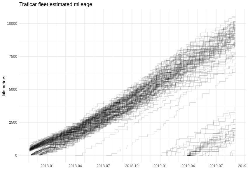
Having that number, we can easily estimate the whole fleet’s mileage by applying it to the fuel consumption, which is known for the whole period. The graph is looking more angular now, as refueling takes place every few hundred kilometers. If we are correct, some Traficar cars have already passed the 10,000 km mark.
Foresight
When you run a continuous service, constant monitoring is essential to know what is happening right here and now. Online dashboards are a common analytic tool, helping dispatchers and the maintenance staff of nuclear power facilities, power grid services, company fleet management and even Cloud providers, as well as scaling right down to tiny eCommerce and single website operators.
But the “here and now” is not enough. You need to care about what will happen next (or even further in the future) and how you will react when it happens. In the case of car sharing fleet management, you will (and should) want to predict the demand, but also determine the marginal profit if/when you change the supply.
Enter Machine Learning and time series forecasting. The general idea is trivial: feed the algorithm with historic data, let it find the patterns and internal dependencies, then apply the discovered rules to predict future values.
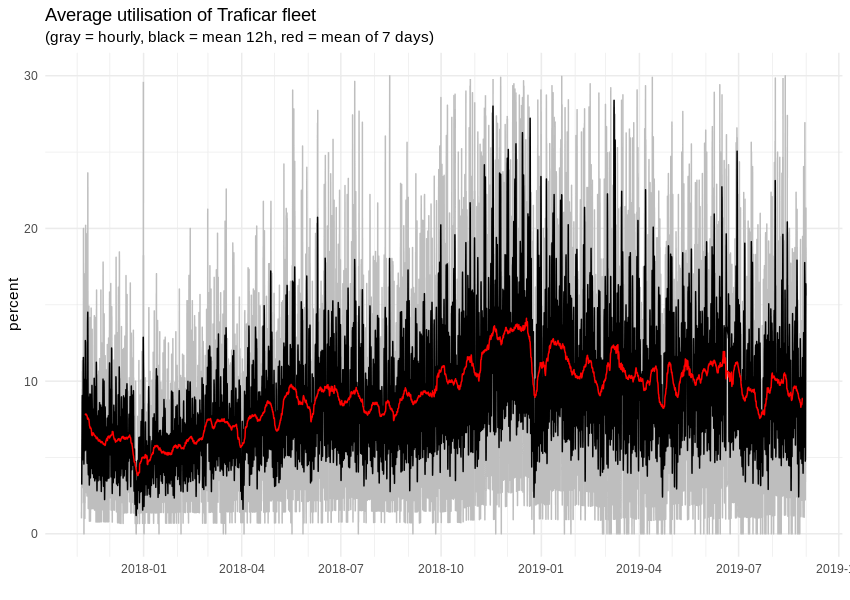
There is only one problem - we can’t predict the number of trips or minutes of rental time, as it depends strictly on the number of available cars. That last value is not flexible, as car leasing has strict dates, some vehicles will get damaged and so on. However, we can monitor and predict the utilisation of the fleet, in which case the car number will become an independent parameter. As we can see, on average, around 10% of cars are rented but, depending on the hour and week day, this value will float between 0% and more than 30%. Overall, car sharing demand has strong seasonality, with clear daily, weekly and monthly patterns.
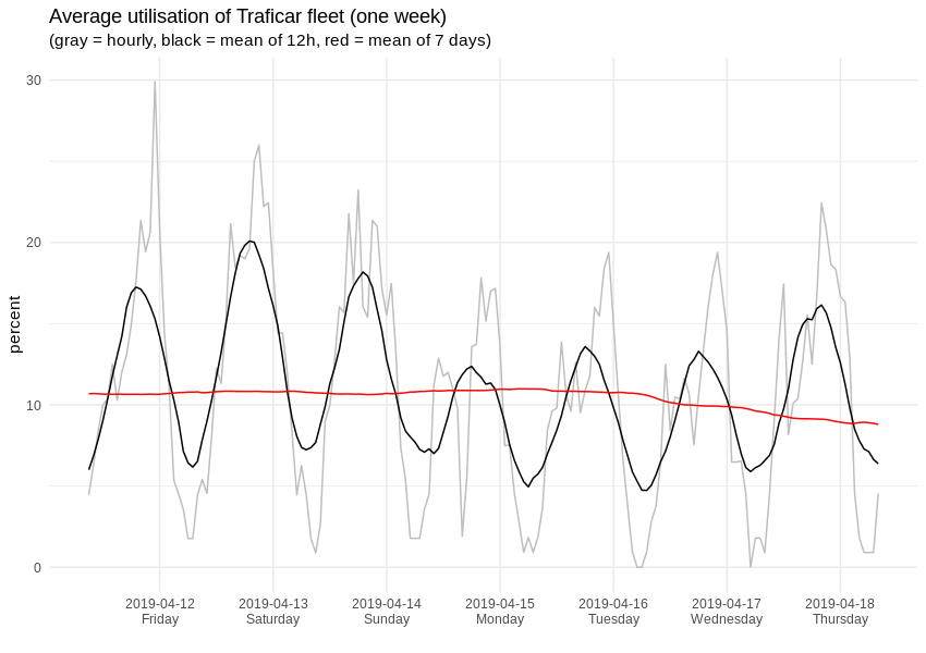
When we zoom to some random 7-day span, it looks like this:
For creating actual predictions, we decided to use the open-source Prophet library, developed by Facebook, which is not only able to automatically detect seasonal patterns, but also allows the use of custom predictors. We remember, from analysing Vozilla’s data, that short-term car sharing demand differs noticeably between work days and weekends. Having that in mind, we replaced the single hourly seasonality with a double set, keeping work-free days separately.
Prophet provides a nice way of displaying detected seasonality components, which helps you understand how the final prediction is made. Here is the breakdown of a 30-day fleet utilisation foresight (the y-axis is the percentage of rented cars in the whole fleet):
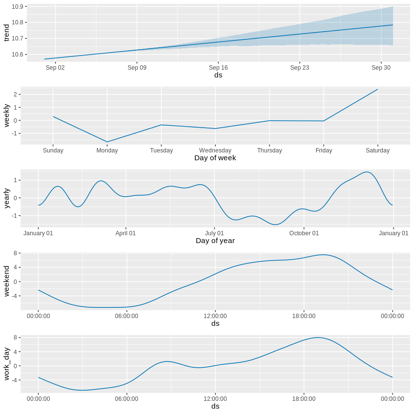
The first section describes a slowly increasing long-term trend but, at the same time, we observe a growing uncertainty of future values. Overall, the base value of the car sharing network’s utilisation lies a little above the 10 percent mark. The second strongest indicator is the hourly pattern, for both work days and weekends (the former features a morning demand bump that is missing from the latter) - this part moves the needle by 8 percentage points. The week day contributes up to 2 percentage points, while the influence of time of year is even weaker – yet, even here, we can spot lower demand during summer vacations and higher peaks around Christmas, for example.
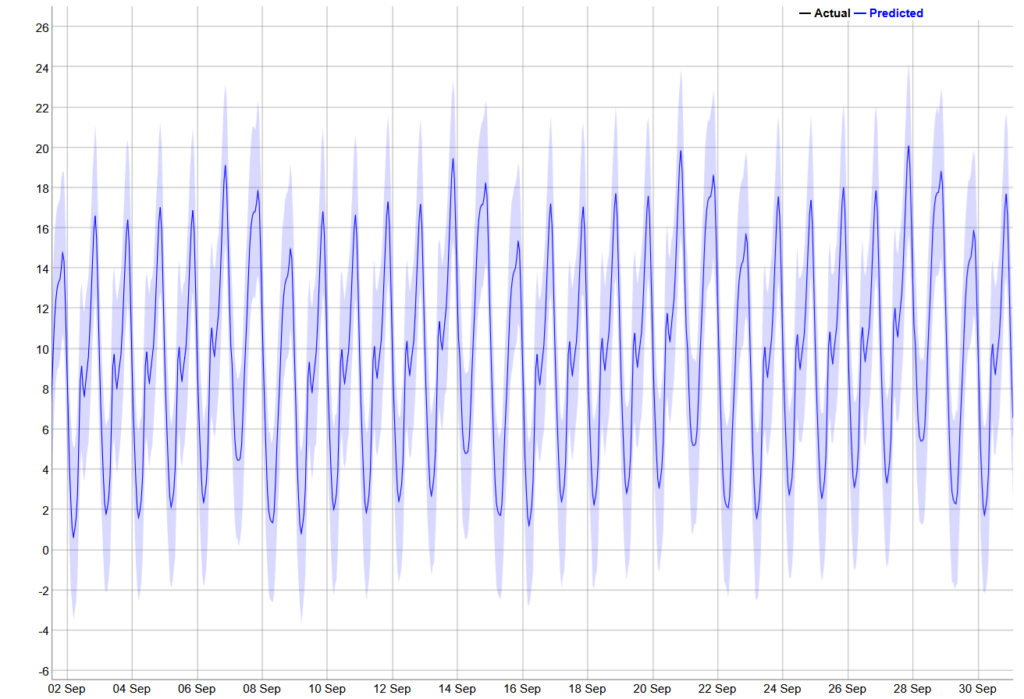
For comparison, the 30-day prediction, visualised below, is way more cryptic and any correlations between components are much harder to spot.
Of course, our data only describes demand in the city of Wrocław. If, for some other city, Traficar can spot an inverted seasonal pattern (i.e. a high demand in the summer and a drop around New Year), it could make sense to periodically move cars between such locations, to maximise average utilisation. That could be the example of actionable foresight provided by Machine Learning - one that is way harder to spot during day-to-day fleet maintenance.
Another example of utilising this foresight in daily fleet management could include identifying the high and low demand areas to estimate the chances of renting a given car within a few hours. Each week, companies like this need to carry out a technical inspection on a few cars; armed with this data, serviceman could ensure they pick a car with the lowest rental probability.
It is hard to prophesise, especially about the future
Now that our prediction is ready, we’d like to know how reliable it is. Well, unlike other areas of Machine Learning, we can’t. The future is unknown. A typical Machine Learning validation method, splitting data between learning and test sets, won’t work here, due to temporal dependencies in our single data stream.
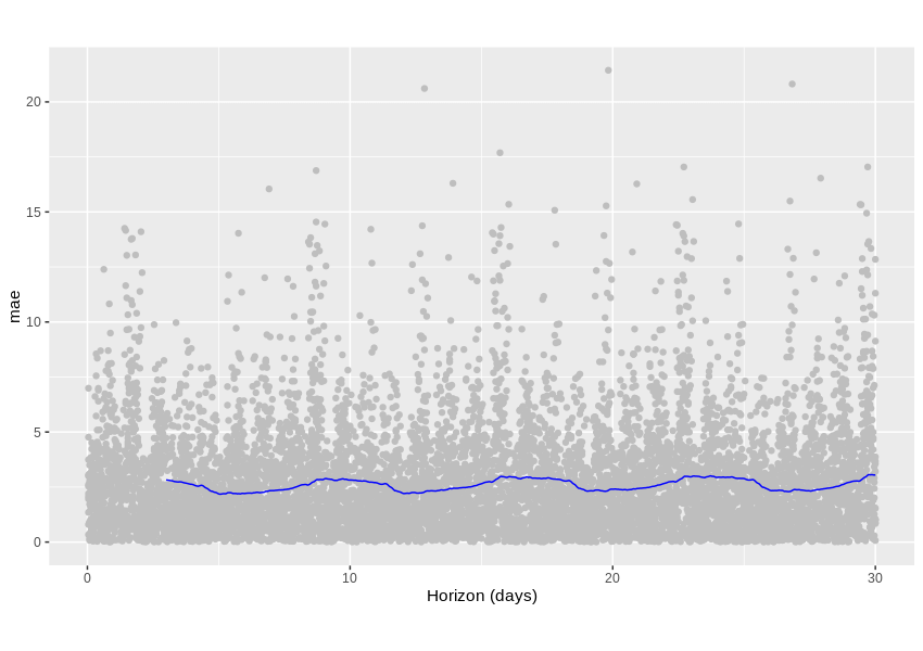
What we can do is learn how our algorithm would predict an already known past. For example, we could go back in time 4 months and prepare a 1 month prediction, saving it somewhere. Then, we could advance one week, prepare a 1 month prediction, then save it. Rinse and repeat a dozen more times, then check the achieved accuracy. Since we only operate on historical data, we can compare predictions with actual observed values.
The graph below shows the Medium Absolute Error metric, which tells us exactly that - how many percentage points are we usually off the true value. An average error lies a little below 2.5 percentage points, which doesn’t sound very bad for a predicted variable ranging from 0 to 30 percent.
Is it good enough? That’s hard to tell, especially given the fact that our scraped data can include some unknown flaws, but it’s a promising start, for sure.
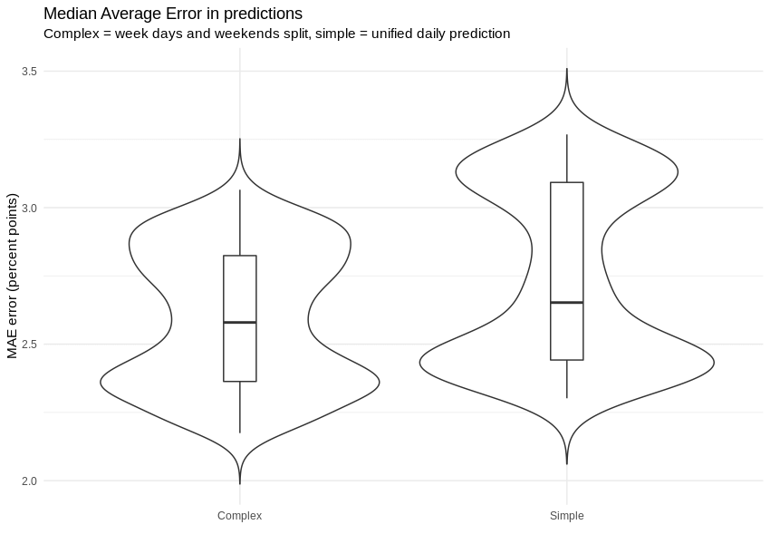
What we can do is compare the distribution of the average absolute error with (left) and without (right) work day / weekend predictor split. As we can see on the following graph, we were able to prepare estimations with errors that are not only smaller, but also distributed in a more coherent matter. An ‘out of the box’ hourly predictor cannot capture characteristics of work day and weekend at once.
KPI predictions visualisation
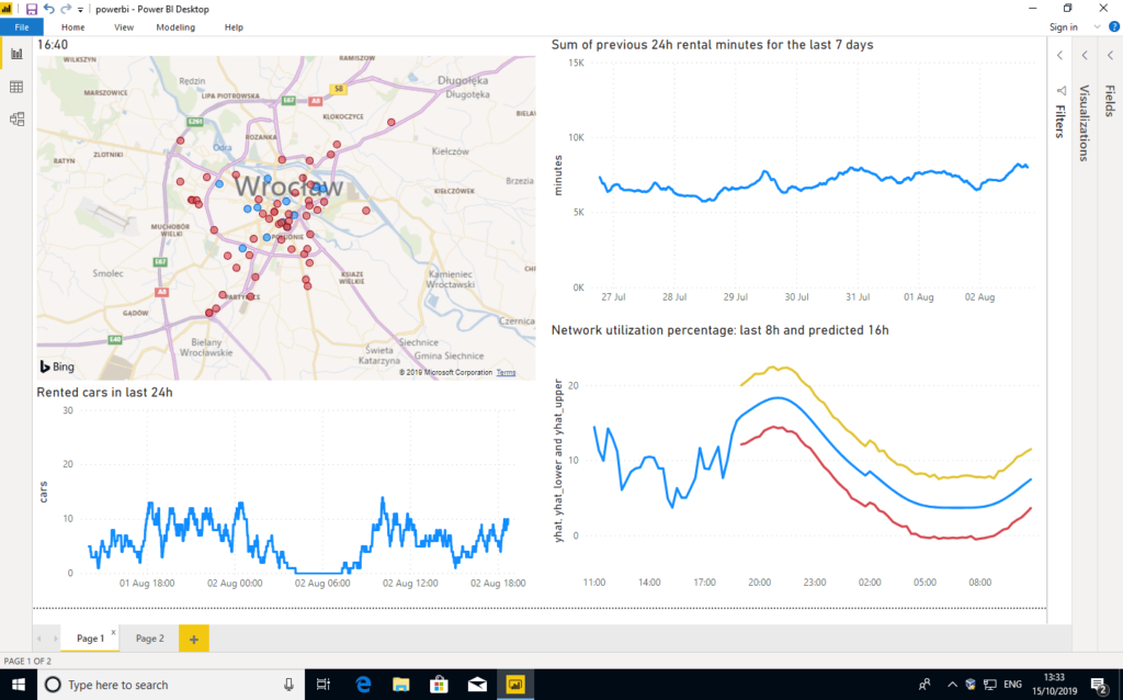
Key Performance Indicators (KPI) are a performance measurements for evaluating the success of an organisation or of a particular activity. We will show three methods of building an online dashboard with live monitoring of the most important car sharing network metrics. All methods use raw numbers from calculations performed with R language, but the visualisation methods differ. What’s important, besides simple graphs, we also wanted to visualise positions and current status of cars on city map.
Our first approach was to use some 3rd party web dashboard and we failed badly. There are dozens or even hundreds of online KPI dashboard tools, but the vast majority of them lack even basic map tools or widgets. Also, the number of external data connectors and quality of data-wrangling tools left much to be desired. We were disappointed by such shortages, like leaving users with no way to plot two data series on a single graph or not allowing to bind rows from two separate files, even if the schemas were fully matching.
Later, we decided to try Power BI and Tableau, two leading data visualisation tools praised for their extensibility and flexibility. Our experience was much better here, as both products allowed us to import and visualise data - mostly in the way we wanted.
Having said that, we quickly reached the limits of customisability, as we often couldn’t tweak map views as much as we wanted to. For example, when it comes to PowerBI and Bing Maps, we had to choose between “too big” and “too small” zoom levels, with nothing in between.
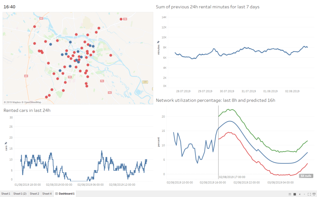
The most flexible and customisable dashboard was created using R language itself. Of course, that method requires programming skills and is, for sure, not friendly for people accustomed to graphical interfaces, but a skilled developer will be able to achieve any visual effect he wants – either using existing widgets or creating new ones from scratch. After the dashboard engine was ready, it was trivial to generate consecutive dashboard images, so below we present a video covering full 24h of Traficar operations, with current performance and predicted utilisation.
Summary
As you can see, even with publicly available information, we were able to determine a lot and generate a number of critical insights. Just imagine what we could do with access to the full set of data!
Business Perspective
Analysing data over specific time periods can showcase plenty of opportunities, from seasonal availability to the best times to offer a more competitive service. However, to achieve this, you first need to look at historical and current data to identify the key trends – something advanced data solutions can readily streamline!
Written by
Xebia Author


Contact